As part of the Whiteroom team I worked on developing the brand positioning and visual identity for Berg as part of a wider brand initiative to develop the brand for a global marketplace which would cover not only their brand identity but also their retail strategy and implementation, social strategy and online channels.
The purpose of the brand positioning and visual identity was to reposition Berg to bridge the gap between traditional outdoor brands and high street fashion brands.
In doing so they aimed to create a brand that was positioned for a new type of consumer who prefer to mix and match their outfits to match their varied and active lifestyle.


The first stage of the project revolved around creating a clear vision of who the rebrand would be targeted to - aiming to understand and rationalise the brands offering and how it could align with their new consumer before creating a position for the brand to build their creative strategy and visual identity on.
Through the discovery stages of the project we identified the mixologist as their new target audience.
With a keen interest in outdoor lifestyle activities, but based in or heavily connected to urban environments the mixologist is a frequent buyer, who is up to date with the latest trends and technology. Typically they will invest in key pieces and mix and match their wardrobe to their activity preferring to mix brands that are most appropriate while still providing value for money.


With a solid understanding of Berg’s product offering, and who the target audience was, we worked to create a new position for the brand that would create a point of difference within the market.
By developing a series of brand attributes based on consumer and market insights along with our early research on the current brand and offering we created a concise brand positioning statement that would form Berg’s brand essence and drive the creative direction of the rebrand project.


To ensure the visual identity was relevant to the new consumer we proposed a clean and minimal visual language that would compliment the product style - using clean typography and iconography throughout and supporting the brand elements with bold and captivating product and lifestyle imagery.
Starting with the core brand assets including the logo and associated lock ups, colours, typography and imagery we build a brand style that could work across a range of applications from the product level - such as labels and swing tags - through to OOH advertising and online
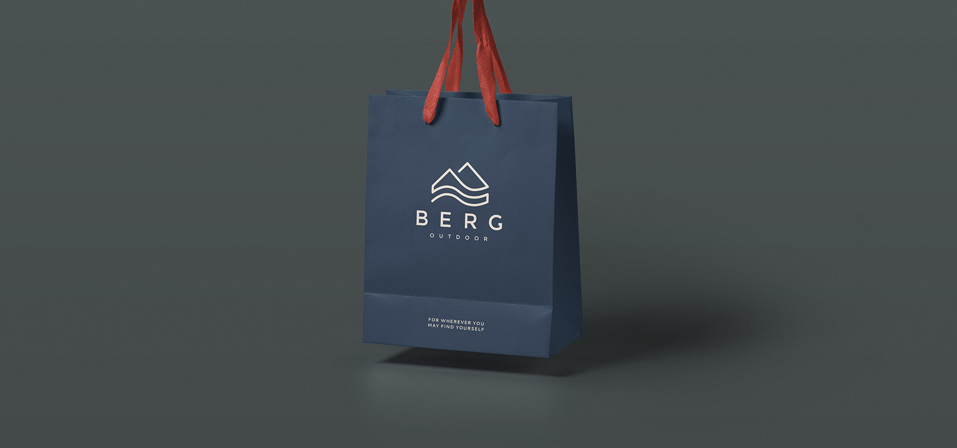
The logo which is an evolution of their previous logo depicts a mountain (Berg is German for mountain) using a single line to show the journey from city to nature.
The logo with its clean lines and uncluttered style can be used alone or within a lock up to show the brands new values, moving away from a performance look and feel to a more trustworthy and versatile brand mark.